Identity-icons
Cheburaskini Brothers
2016
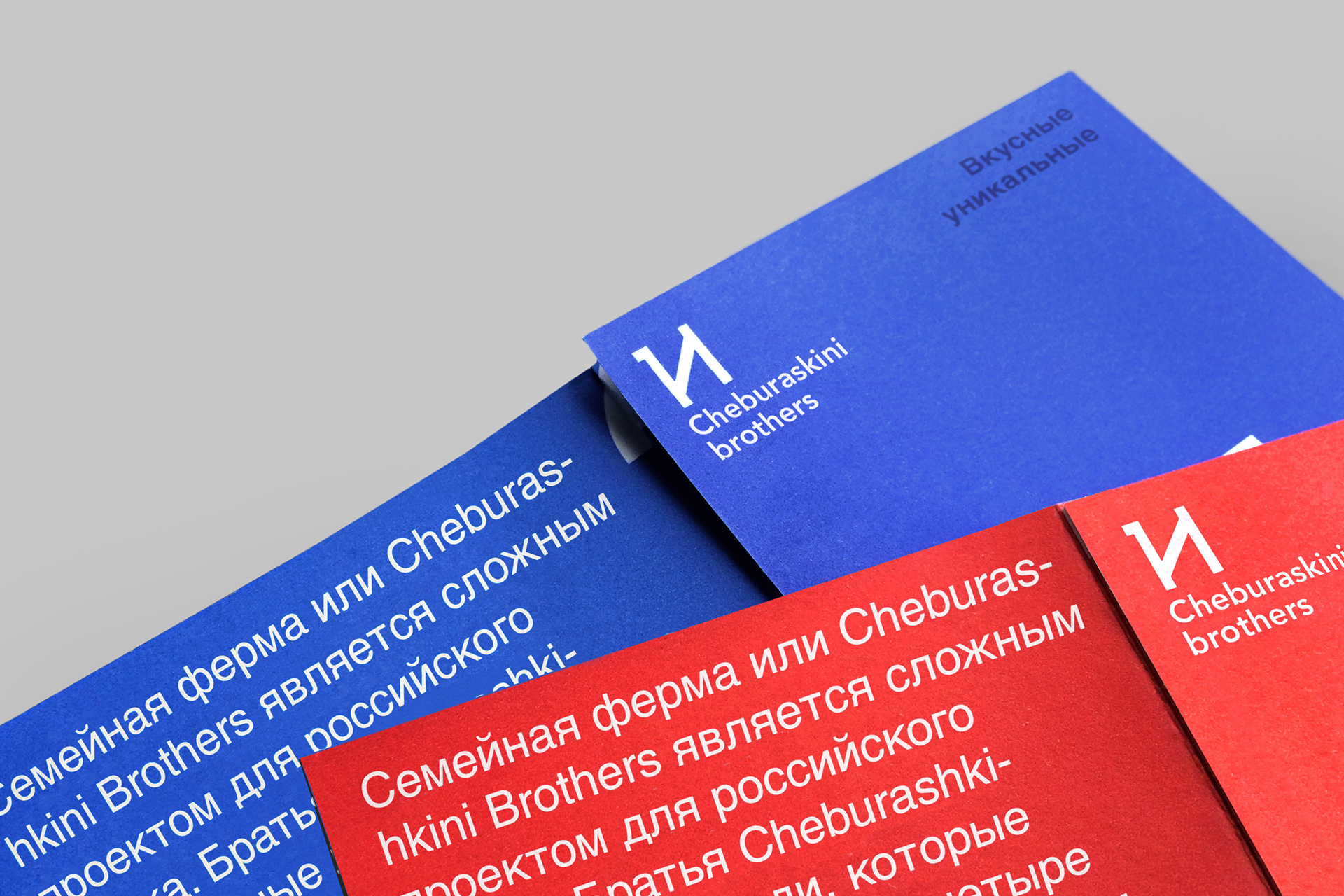
Cheburaskini Brothers
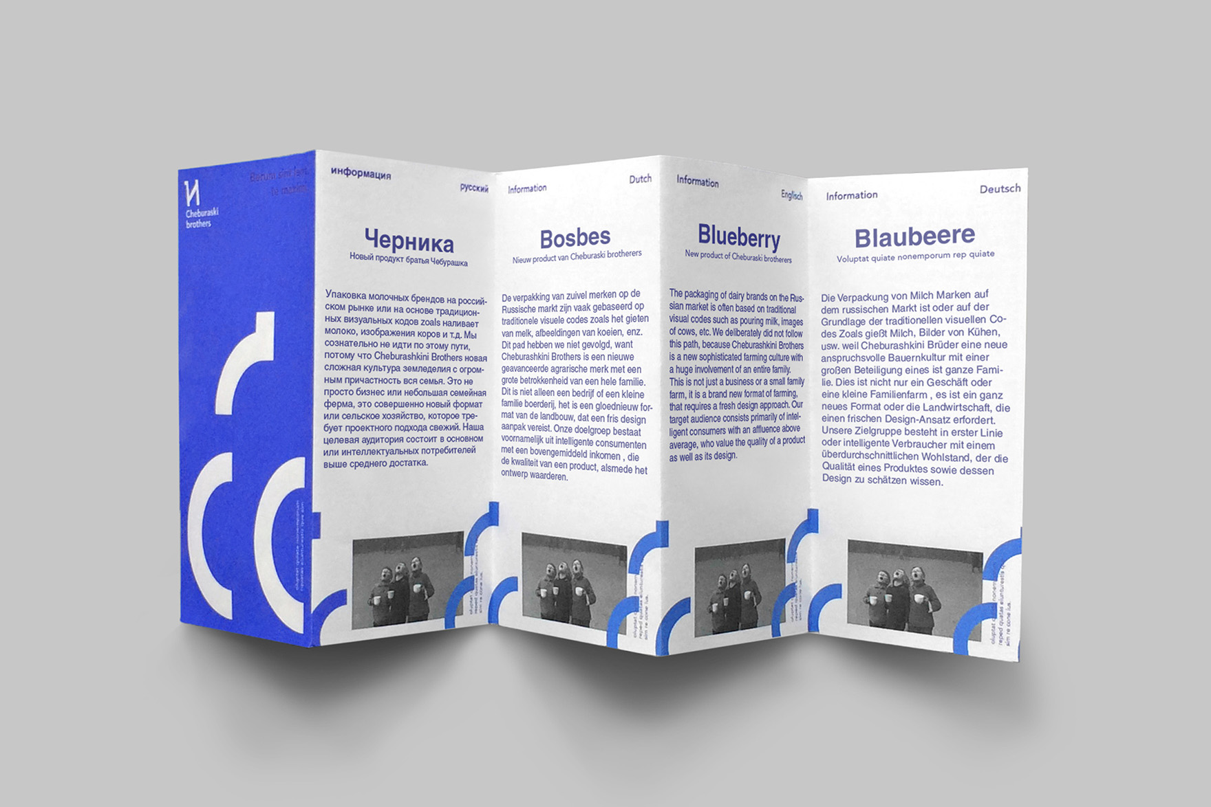
The family farm of Cheburaskini Brothers is a challenging project for the Russian market.
The packaging of dairy brands in general is often based on traditional visual codes such as pouring milk, images of cows, etc. The new identity deliberately did not follow this path, because Cheburaskini Brothers is a new sophisticated farming culture with a huge involvement of an entire family.
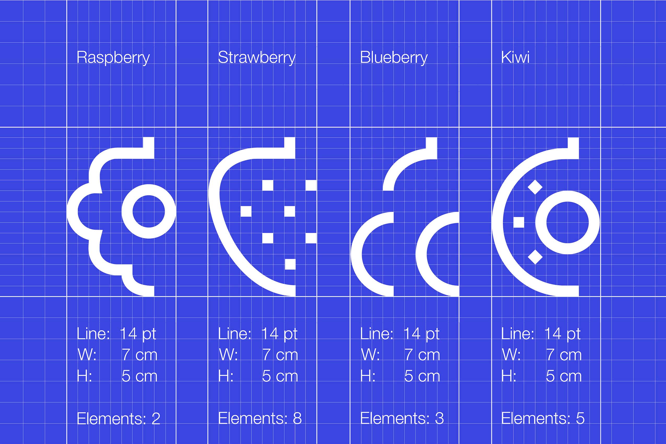
Commissioned by Ermolaev Bureau a design was created for a future children's sub-brand of Cheburaskini Brothers (by Ermolaev Bureau). In contrary to what the original identity is doing; namely focusing on the different stages of production, the sub-brand is making the experience and taste of the fruit drinks the most important aspect of the design. Four different icons were made to formalize this idea.